Table of Contents
TogglePlanning a fall wedding offers one major advantage over spring and summer celebrations: the color palette practically writes itself. September through November brings warm foliage, dramatic skies, and natural inspiration that translates beautifully into decor, florals, and attire. Instead of fighting the season’s aesthetic, smart couples lean into it, selecting tones that echo the landscape while adding personal flair. The right color scheme doesn’t just coordinate details: it sets the mood, influences venue choices, and creates cohesive visuals from invitations through the last dance. Whether leaning toward classic autumn richness or modern unexpected contrasts, these 15 fall wedding color schemes deliver impact without requiring professional design chops.
Key Takeaways
- Fall wedding color schemes leverage autumn’s natural backdrop—golden light, softer skies, and seasonal foliage—to make rich, saturated tones photograph beautifully without harsh shadows.
- Classic fall color combinations like burgundy and gold or rust, terracotta, and sage offer timeless elegance or bohemian warmth depending on your venue and personal style.
- Modern fall wedding color schemes such as navy, copper, and blush or plum, mauve, and dusty rose provide sophisticated alternatives that balance unexpected tones with seasonal depth.
- Seasonal florals like dahlias, chrysanthemums, and natural foliage cost less in fall while holding up better than imported blooms, allowing you to invest more in color impact and design.
- Test fabric swatches and metallic accents in your actual venue lighting before committing, as colors shift dramatically under different light sources and can make or break your overall aesthetic.
- Layering textures and finishes—mixing matte and metallic elements—prevents flat color palettes while creating visual interest that enhances photography and guest experience.
Why Fall Is the Perfect Season for Rich, Romantic Color Palettes
Autumn’s natural backdrop does the heavy lifting. Venues, barns, vineyards, gardens, or even industrial lofts with large windows, look better in fall light. The golden-hour glow lasts longer, and overcast skies create soft, even lighting that flatters photography without harsh shadows.
Seasonal florals cost less and hold up better. Dahlias, chrysanthemums, and marigolds peak in fall, providing texture and color saturation at lower price points than imported blooms. Foliage like eucalyptus, olive branches, and dried grasses add volume to arrangements without inflating the budget.
Deep, saturated colors photograph exceptionally well against autumn’s muted greens and browns. Where pastels can wash out in bright summer sun, jewel tones and earth-based hues pop in fall’s softer natural light. This seasonal advantage extends to table linens, bridesmaids’ dresses, and even cake design, rich tones read as intentional and elegant rather than trendy.
Temperature shifts also expand wardrobe options. Velvet, wool blends, and heavier fabrics work in cooler weather, opening up richer textures that complement bold color choices. Shawls, capes, and tailored jackets become design elements instead of afterthoughts.
Classic Fall Wedding Color Combinations
Burgundy and Gold: Timeless Autumn Elegance
Burgundy (sometimes called wine, oxblood, or maroon) anchors countless fall weddings for good reason. It’s formal enough for black-tie affairs but warm enough for rustic venues. Pair it with metallic gold accents, not solid gold, which skews gaudy, but brushed gold flatware, champagne-toned linens, or gold-rimmed glassware.
For florals, burgundy dahlias, garden roses, and ranunculus work well alongside cream or ivory blooms. Greenery like seeded eucalyptus or dusty miller keeps arrangements from feeling too heavy. Bridesmaids in floor-length burgundy gowns look polished against groomsmen in charcoal or navy suits with gold-toned ties.
Table settings benefit from layering: ivory base linens, burgundy napkins, gold flatware, and clear glassware create depth without clutter. Avoid matching every element, mix matte and metallic finishes to keep the palette from looking flat. Candles in amber glass votives add warmth without competing with centerpieces.
This combination translates across themes. Formal ballrooms lean into the richness with velvet and satin, while barn venues balance burgundy with raw wood and Edison bulb lighting. The palette’s versatility makes it a safe choice for couples who want classic elegance without cookie-cutter predictability.
Rust, Terracotta, and Sage: Earthy Bohemian Vibes
For couples drawn to organic, less formal aesthetics, rust (burnt orange), terracotta (clay-toned coral), and sage green deliver bohemian warmth. This palette skews casual and works best in outdoor or semi-outdoor venues, think vineyards, desert landscapes, or gardens.
Rust and terracotta are desert tones, so they pair naturally with succulents, pampas grass, and dried florals. Fresh elements like garden roses in peach or apricot tones soften the palette, while sage greenery (actual sage, olive branches, or lamb’s ear) provides contrast. Avoid dark greens, which clash with the warm base colors.
Bridesmaids can mix and match shades, one in rust, another in terracotta, a third in sage, for a curated, non-uniform look. Linen or chiffon fabrics work better than satin: the goal is relaxed texture, not formal sheen. Groomsmen in tan or light gray suits with rust-toned ties keep the party cohesive without looking matchy.
Table decor should lean into natural materials: wooden chargers, ceramic plates in cream or white, woven placemats. Terracotta pots (small, 3-4 inch diameter) double as favors and centerpiece holders. Candles in terracotta or amber tones extend the palette without adding visual clutter.
This scheme fits desert, Mediterranean, and rustic themes but struggles in formal ballrooms. It’s also weather-dependent, overcast skies dull the warm tones, so backup lighting (string lights, lanterns) helps maintain the mood if conditions shift.
Modern and Unexpected Fall Color Schemes
Navy, Copper, and Blush: Sophisticated Contrast
Navy blue isn’t an obvious fall choice, but it grounds bolder accent colors and reads as formal without black’s severity. Pair it with copper metallics (not rose gold, which skews too pink) and blush pink for a palette that feels modern and gender-neutral.
Navy works as the dominant color, bridesmaids’ dresses, table runners, or suit jackets, while copper and blush function as accents. Copper flatware, votives, or geometric centerpiece frames add metallic interest without overwhelming. Blush appears in florals (garden roses, ranunculus, spray roses) and soft details like napkins or ribbon.
This combination benefits from high contrast. Navy and blush side-by-side create visual separation, while copper bridges the gap. Avoid pastel pinks, which look washed out next to navy: choose blush with peachy undertones that lean warm. Greenery should stay muted, dusty miller, eucalyptus, or olive branches work better than bright greens.
Venue matters. Navy-heavy palettes shine in industrial spaces (warehouses, lofts) or modern hotels with clean lines. Rustic barns struggle with navy unless balanced by warm lighting and natural wood tones. If working with a barn, increase copper accents and warm whites to prevent the space from feeling cold.
Incorporating wedding color schemes for fall that balance unexpected tones requires testing samples in your actual venue lighting. Navy shifts in appearance under different light sources, what looks crisp in daylight can read almost black under tungsten bulbs.
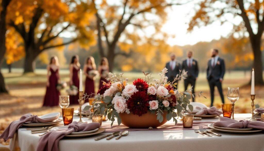
Plum, Mauve, and Dusty Rose: Moody Romance
For couples who want fall depth without earth tones, plum (deep purple), mauve (muted purple-gray), and dusty rose (faded pink with gray undertones) create a moody, romantic palette. This scheme leans feminine but avoids saccharine sweetness through its tonal complexity.
Plum serves as the anchor, deep enough to ground the palette but not as heavy as burgundy. Use it in velvet bridesmaid dresses, napkins, or ribbon details. Mauve functions as the mid-tone, appearing in florals (lisianthus, stock, sweet peas) and soft goods like table runners or shawls. Dusty rose lightens the palette in centerpieces, invitations, or cake florals.
Greenery choices matter here. Bright greens clash with purple tones: stick with silvery foliage like dusty miller, eucalyptus, or olive. Dried elements (lagurus, bunny tails, bleached ferns) extend the muted aesthetic without adding visual weight.
Metallic accents should lean cool-toned. Silver or white gold work better than brass or copper, which introduce warmth that fights the palette’s cooler base. Consider mercury glass votives, silver-rimmed chargers, or brushed nickel flatware.
Lighting transforms this palette. Warm Edison bulbs or candlelight soften the purples and bring out pink undertones, creating romance. Cool fluorescent or LED lighting makes the colors look flat and gray, test lighting during setup or request warmer bulbs from the venue.
This combination appears in curated fall palettes that prioritize tonal harmony over high contrast. It’s also forgiving photographically: the muted tones don’t oversaturate in images the way bright jewel tones sometimes do.
Table settings benefit from layering textures: silk or velvet runners over linen tablecloths, matte ceramic plates, and glossy glassware. The goal is visual interest through finish variation rather than color complexity. Keep the palette to 3-4 tones maximum, adding more risks muddiness.
For couples considering this scheme, order fabric swatches in advance. Plum and mauve vary wildly between manufacturers: “plum” can range from reddish-purple to blue-purple depending on the dye lot. Matching samples to your venue’s existing colors (chairs, drapes, carpet) prevents clashes that only become obvious on the wedding day.
Seasonal florals in these tones are readily available. Dahlias, roses, and lisianthus all come in plum and mauve shades, keeping costs reasonable. Avoid forcing the palette onto flowers that don’t naturally occur in these tones, dyed blooms look artificial and photograph poorly.
This palette works across venue types but excels in spaces with architectural interest. Stone buildings, vintage theaters, and historic estates provide textural contrast that prevents the soft colors from feeling flat. Modern minimalist venues benefit from adding texture through linens and florals to avoid a washed-out look.
Groomsmen attire should stay neutral. Charcoal or deep gray suits with mauve or plum ties maintain cohesion without overwhelming the palette. Black suits create too much contrast and pull focus from the softer tones. If the wedding party prefers variety, mixing charcoal and medium gray suits creates visual interest while staying within the color story.